Tuesday, August 31, 2010

Painted Floors

I'm totally into painted floors. They sound impractical, but if done the right way, you can get a really cool look that looks even cooler as it wears. These oak floors were once stained very dark. They sanded them down, painted them white and then put down a polyurethane similar to the finish they put on professional basketball courts to make them really durable.

In the right space, these floors could make a crazy statement. I really like the white that this family did in their beach house. I could also see a these done in a cooler grey tone with the white trim. The painted brick detail behind this dining set is pretty kick ass too. Looks like it could have been an old fireplace.

(via Coastal Living)

Monday, August 30, 2010

Sink in the Wall, Really?


I can't say I've seen this before and I don't know if it would pass code but it's a pretty cool idea if you have a tight space to work with. One small issue you may run into is if your little one decides to turn the water on for fun without pulling the sink out and then bolts.

Friday, August 27, 2010

Another Chapter

Here's a picture of my grandfather in the early 1940's with his first company truck. You can see the Capaldi name on the side. He looks so proud. I stopped by to see him this week. 94 and still sharp as hell. Whenever I see him, it reminds me of the history of our company and how you can never forget where you come from. Have a good weekend.

Thursday, August 26, 2010

Decrepit Beauty


Check out the wall treatment in this house designed by Debra Cronin. It's hard to tell the exact method she used to craft these walls, but I'm really digging it. It might take a bit of getting used to by some, but I think this could make for a really great detail in a study or powder room. Why not give it a try?


Wednesday, August 25, 2010

Using Debris to Handcraft Tile

There is a company based in San Jose, CA producing and crafting some super cool sustainable tiles using recycled glass bottles. The company is called Fireclay Tile and I came across their Debris Series today while researching an interior remodel project. If you're looking for hand crafted and homegrown you should check them out. They offer more than 112 colors in both gloss and matte finishes and have a huge range of design options.

Here's the Debris Series featured in a kitchen backspash they supplied for a remodeled green home in San Francisco. I love the shade of green (or Kelp as they refer to it at Fireclay) against the black tops and bright white cabinets. It even works so well with the small accent of wood countertop they used next to the range.

(photos via Kitchen & Bath Business and Fireclay Tile)

Tuesday, August 24, 2010

Telephone Poles Repurposed


We live in Birmingham, Michigan in a part of town not typically known for its sprawling grounds. When we built the house, we knew we'd want some outdoor living space, but wanted to keep it as private as we could given the lay of the land. What we came up with was a pergola. And, to give it a little character, we decided to utilize old telephone poles as the support structures.


To anchor the poles, we fabricated tumbled paver bases, filled them up with concrete and then topped them off with some river rock.


We ended up planting a couple varieties of grapes and within a couple of years, we have the perfect canopy for the space. However, we have yet to have fresh dolmathes from my Greek wife.


We used a combination of 2x8's, 2x12's and 2x2's to tie all of the telephone poles together. It really makes for such a perfect hang out spot. As a matter a fact, I wrote this entire post, beer in hand, out here on the patio. Summer living.

Monday, August 23, 2010

Stained Glass


Check out this stained glass window for sale at a local salvage yard. It's an arts & crafts piece from Chicago circa 1915 and is on sale for $245, which is a total steal. I could totally picture this in a Tudor style house as a little accent window in a staircase facing the street. Or, with its statement black frame, it would look cool in a bathroom or even as a transom in a hall archway.

Friday, August 20, 2010

Not Your Typical Secondary Entry


There are so many things I love about this picture. From the dutch door to the custom iron newel post on the stairs. I could literally point out so many details within this one picture...too many for anyone to want to read. So, I'll just focus on a few. The utilization of space under the stairs is genius. No one uses that space and it is such a great way to get a little extra storage out of an otherwise underutilized area. The shiplap siding used on the walls of the interior of the house is such a creative way to give character to the space. It provides a great casual feel that I think is really cool. The use of brick in this secondary entryway is a durable alternative to slate or tile. I am always a fan, said it a ton of times before, of bringing a traditionally exterior material to the interior of a house. And, the color they chose is a great compliment to the black and white of the rest of the room.

Thursday, August 19, 2010

Wood Tops

Are wood countertops right for the kitchen? There are pros and cons to any kitchen surface but like concrete, I feel like people shy away from the wood too soon. Some of the things I like about them is that the surface has a warmer feel to it and the wood can serve as a great cutting surface if you're incorporating a butcher block style. On the other hand, they are prone to water damage if they're not properly sealed periodically. It's also a softer material so it is more likely to show scratches and cut marks. With a little thought up front and a bit of maintenance down the road, wood countertops can be a great alternative.


Craft-Art Wood Countertops, an Atlanta based company, has some nice green options for wood tops. They have a cool gig because each species of their reclaimed wood tells a little story. It's so interesting to know that the Old Growth Cypress they offer, for example, comes from pickling vats that date back to the 1930's and 40's.


Wednesday, August 18, 2010

Nooks and Crannies


As a kid, my wife had a bedroom with a dormer and to this day talks about how she loved that room. Sometimes creating a little niche within a wall can add a little dimension to an otherwise plain space. It can create a unique place for custom built-ins, or just childhood memories, like my wife's.


(photo by Jessica Helgerson via Design Sponge and My Home Ideas)

Tuesday, August 17, 2010

Statement Staircases


Staircases aren't often thought about as statement aspects of a house. But, no one wrote a rule that says staircases have to be straight with a tiny landing. This Shaker inspired curved staircase is a bold statement, but the white walls help to tone it down.


This staircase is really cool. I love how they followed the pattern of the stairs leaving the underside exposed. It adds a ton of charm. That metal window isn't bad either.


The large landing and dark wood floors with white risers create a really cool feel within this staircase. The thin dark wood handrail along the wall creates a perfect balance to the openness of the hall.


Monday, August 16, 2010

Great Interiors

I really like this post by Tracery Interiors, a Birmingham, Alabama interior design firm. Their attention to detail is amazing from the finishes to the unique light fixtures and custom cabinets.

The house does not consist of any drywall/sheetrock. None. All wood.

Another great use for white carrera marble. Two little things they did in this space that I really like. They put in a small recessed soap dish and they arched the ceiling matching the line of the wood trim. Small details that are very crafty.

Friday, August 13, 2010

Black and White

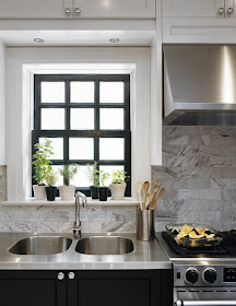
Saw this on Shelter and thought it was great for a kitchen on the smaller side.
The black base cabinets with the white uppers are a very nice touch. Another nice design feature is the bold use of the black on the windows and doors. Notice that they didn't paint the trim black, just the door and window frame. Looks so good against the white. It's just enough to make them pop. One more piece that you don't see too much of is the white carrera marble subway backsplash. Once again tying the black and white together.

Thursday, August 12, 2010

Laqured Moldings


My wife has had an issue of Maison et Demeure, a Canadian design magazine, sitting on our coffee table for months now. I came across Victoria Webster's home in an older publication and thought that her foyer was amazing. The ornate black laquered moldings and wainscoting along with the white walls and green runner (from French fabric mill Codimat) really balance the room well.

Wednesday, August 11, 2010

Kids' Bath


I know I just posted about a sink yesterday, but this would be a pretty sweet set up in a kids' bath.

(picture via Maison et Demeure)

Tuesday, August 10, 2010

The Farmhouse Sink

Here's a classic. The Farmhouse sink. This one looks vintage but it's actually by Kohler. We put a similar style in our house and I love it. It's deep and durable and I think they look great.

Here's one with two separate bowls which is nice. And how about the wood tops? I really like how they overhung the top on the lip of the sink and then carved out little grooves so that water finds it's way from the top into the sink. I'm all about the little details.

photos via Southern Living and withknobson.com

Monday, August 9, 2010

Airy Kitchen

This kitchen from House Beautiful is pretty cool. The Dutch gable that they painted adds a bit of decoration to an otherwise plain white wall.

A nice little prep area for fruits and vegetables only. I love this idea, especially having the faucet valve low and within the backsplash. Clean and genius.


The window wall in unique in that it doesn't go all the way to the ceiling, but it does go all the way to the floor. Really opens up the space.

Not a bad way to end the day.

Friday, August 6, 2010

Subway

Turning the subway tiles is something you don't see very often but it works well in this more contemporary/industrial style bath. I also like how they used a darker grout color allowing the tiles to make more of a statement as well as compliment the exposed plumbing valves and shower head.

photo via Remodelista

Thursday, August 5, 2010

Wood Floors

I love wood floors. There are a ton of options for hardwood out there on the market. You can even find some great stuff in salvage warehouses. We have three different species in our house and this one is by far my favorite. It's 2-1/4" White Oak No. 2 Common. It's not the lowest grade but just one step above. They wouldn't sell me the lowest grade because they thought I would come back complaining that it was so awful I couldn't use it.


I told my installer to basically just throw it down. I didn't want him to fit it super tight nor did I want him to fill any holes or knots. Call me crazy but it worked, we saved a ton of money and got a rustic look. The wood was very inexpensive and beat up (basically because no one else wanted it) and I didn't want him to make it look polished. He did a great job and we love it.

Wednesday, August 4, 2010

Stairway

A stairway can make a statement. Whether you're building a custom home and designing something grand or renovating what you currently use, their are so many different things you can do with colors and materials. We went black on the newel and handrail (photo above).

I love this. A custom hand-forged iron stairway railing by Bill Peck and featured in House Beautiful April 2010. Compliments to my dear friend and client JC.

The cable railing system with the wood handrail. A modern look that we have been doing more of lately.

This is great. A coat of paint on either side and you've got your own custom (and rustic in this case) runner. A nice alternative on a budget via Design Sponge.

Tuesday, August 3, 2010

3 Things


There are a ton of things in this little cottage kitchen by Ken Fulk that really work for me so if I could only pick three, here they are. The old truck springs being used for stools are so creative and just the perfect size too. The reclaimed wood fence pieces being used to face the cabinets adds charm and also complements the rustic quality of those stools. And finally, the blue stone on the floor. I see it so many times being used on the exterior but I love the idea of using it inside and then carrying it right outside.

Monday, August 2, 2010

Dutch Door

A great option that doesn't seem to get much love.


Originally designed before electricity and air conditioning to allow natural light and air to flow throughout the entry while preventing the livestock from wandering into the house.


It doesn't have to open to the outdoors either. You could use one to separate the Kitchen from he Mud Room or even your Dog Room.