Thursday, September 30, 2010

35 Years Later


They call it the Re-Cover Residence and it was designed by Bates Masi Architects. I know I'm all over the architects this week but here's another that worked with the existing structure and elements to craft this renovation and addition. And, it also helps that Bates Masi originally designed the place back in 1970. Nice work by the owners too, going back to original architect. A solid decision and great compliment.

There is a great deal of craft and workmanship that went into this project. In the process of making room for the new addition they salvaged much of the twelve inch cypress boards that clad both the interior and exterior of the home and machined them into new siding. The key for me is the impeccable union of new to existing. That's a true skill in my opinion. Great work from owner to architect to craftsmen.

On the interior they created this balance from room to room with smooth horizontal walking surfaces, rough vertical wall texture and a polished countertop finish.

via Bates Masi Architects

Wednesday, September 29, 2010

Writing on Walls


A cool little idea. Have you seen or heard of such a thing? If you can paint it, now you can apparently write on it. Mom is going to love this. It's called IdeaPaint. You put it up and it turns into a dry erase board. One coat and seven days later you're creating and collaborating. Hey, if you don't like it or you're sick of it, just paint over it and move on. A great tool for a kids room or the mudroom or anywhere really.


Photos via IdeaPaint and Behance Outfitter

Tuesday, September 28, 2010

Stonework


I feel like stonework is literally a lost art. I was reading an article yesterday on a historic renovation by Vicente Burin Architects based out in Connecticut and just couldn't pass it up because of the amazing stonework. They worked diligently with this client to restore and add on to an old English stone construction cottage from the 1930's by a self taught architect by the name of Frazier Forman Peters. Peters had a passion for stone construction and loved using local materials (first time I've heard of him and I like him already). When VB Architects took on this project they got after it and took a ton of pride in keeping this sweet exterior look. They were able to utilized local stones but the bigger challenge they said was matching the look and getting the grout joints just right. I totally agree. Custom stonework takes time and precision. A killer job by the installer.


photos by Dan Lenore

Monday, September 27, 2010

Shingle Style Architecture


I love looking at different styles of architecture and over the weekend I was checking out some of the shingle style. This traditionally New England style utilizes shingles all over the house and is very detail oriented. It is such a unique look. There is a definite craft to this style too which is another reason why I like it so much. You have to really know how to apply the cedar in a manner that creates a seamless look throughout the exterior of the house.

Friday, September 24, 2010

Outdoor Shower

It's the weekend and fall is officially here. This is actually the time we get the most calls to do work on cottages or summer homes. The season has come to a close and everyone wants to be in their new digs come late spring. A client I'm working with is renovating a cottage and the one thing that he said he really wanted was an outdoor shower. I love the idea and am all about outdoor spaces and so far these are a few examples of my favorites.

This is actually the only shower in this one room cabin. But, who needs privacy in this setting?

via Mudock Young and Olson Kundig

Thursday, September 23, 2010

Rustic Kitchen

I just came across this modern, rustic, farmhouse style kitchen from the girls over at Remodelista and couldn't pass it up. I'm all over it when we find that farm. They've incorporated so many crazy items. They have the salvaged base cabinets with the same or similar tops, some weathered teak furniture, the industrial lights and a chalkboard for a backsplash. The red jars against the blackboard just set it off and it even helps pick up the hints of red in the cabinets. Also looks like they went with a polished concrete floor.

photo via Anoubk

Wednesday, September 22, 2010

Glass Tops

I was reading an article today about products made from recycled content and came across BioGlass. It is a countertop made from 100% recycled glass. Very sleek and contemporary. The appearance has such a unique, opaque look, similar to a slab or block of ice. It would be a pretty sweet piece in a bath or wet bar. The look of the pieces are designed and manufactured to change as the light changes. I bet it would look pretty cool if you added some light from the bottom and let it reflect up. It would work in the kitchen too. It's heat resistant, easy to keep clean and scratch resistant. It is pricey and colors are limited but certainly worth exploring.

Tuesday, September 21, 2010

Old School Custom Ceramic

It's not about just putting down some cool penny tile in the kitchen. At least, not with this company. American Restoration Tile specializes in custom ceramic tile for restoration work as well as new construction. This kitchen (historically accurate) was created with a combination of a 1" hexagon and a 3/4" square border. If you have a renovation that needs to be matched or added on to, this company can help. In addition, they have a ton of custom colors and sizes. I can't say that I see a ton of ceramic in the kitchen, but after seeing some of the things that this company is putting out, I would seriously consider incorporating a historic layout.

Monday, September 20, 2010

Wallpaper

Wallpaper is not something you think about when you think of the word craft. But, this company nailed it. Madison and Grow is a wallpaper company that creates patterns based off of hand drawn sketches made by the owner that reflect her love for nature. I found this picture of their product in the current West Elm catalog and think it is amazing. Wallpaper is another one of those items that may seem a little dated to some. But, it is alive and well and definitely has a place in current design. The wallpaper in this room balances out the thin crown molding, the tall base molding and the white opposite walls.

via West Elm catalog

Friday, September 17, 2010

Formica, Yes, Formica

Formica seems to have a bad name associated with it. As if it's too embarrassing to be the one to say they kind of actually still like the stuff. Hey, I'm down with it. Although it definitely helps that it's kind of retro. Check it out.


With summer coming to a close, I was going through some photos and found these. We spent a long weekend in Alpena at my sister-in-law's boyfriend's family's (got that all?) cottage. It was the perfect cottage on Lake Huron with a perfect beach and the perfect space. And...it had Formica in the kitchen. It was totally retro and, it just worked. The tops were white with this gold veining. They were sweet and accented with these vintage wood stained cabinets that they painted. A little cottage kitchen make over on a budget. Nice. Something that works and feels right in a space, no matter if it is a current trend or a blast from the past.

Thursday, September 16, 2010

Small, But Organized, Spaces

We don't live in a large house. But, I don't need a large house. I'm all about the trend towards efficiency. I'm all about spaces that matter and that will hold stories and create memories. I'm about rooms with a view that will be enjoyed. I'm about easy, casual and comfortable.
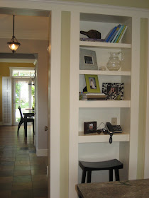
We wanted a 'command center', a place for the mail to be dropped, phones to be set and pictures to be displayed. We borrowed some space from a coat closet and created a built in area with shelving and a space for a stool. It is the perfect spot to put the days piles on until they are ready to be dealt with. I think everyone needs a place to put their 'stuff'. The everyday stuff that piles up day after day...that is, until it needs to be put away.

Wednesday, September 15, 2010

Herringbone

A great little bath alcove but I say the wood herringbone pattern makes the space. I'm a big fan of wood, and yes, even in a bath area. You just don't see the herringbone pattern everyday and to me it just sets the tone here. Also, the little detail of the tub top being white and the tub base painted black mimics the black walls and the white ceiling. So well done. A killer little detail.

photo via Design Actually

Tuesday, September 14, 2010

Waterproof Woven Vinyl

The flooring in this bathroom shot is amazing. It is a waterproof woven vinyl that looks like sisal. The company Bolon has some amazing takes on this flooring, but they don't do waterproof from what I can tell. I think any of the styles in their 'eight' collection would be sweet in an upstairs hallway.

scan via Coastal Living

Monday, September 13, 2010

Barrel Entry

Talk about making a statement when you walk in the door. Amazing details in this foyer. The barrelled ceiling is so well done. Subtle and sweet how it picks up the radius of the window above the door. A smooth connection. The vertical use of wood siding adds to the overall volume of the space and allows for the larger hanging fixture. You can't go small in this space. And don't forget the tall base moulding (which they didn't). Again, it just adds another presence in a room with volume.

via Atlanta Homes & Lifestyles Magazine

Friday, September 10, 2010

Old Tools

Do you have many old tools? They are powerful no matter how big or small. I have a few that have been handed down to me from my dad and grandfather and each one tells a story. I pulled out an old ratchet set the other day while working with my dad and noticed the look on his face. It's not only tells a story but it can also create a bond as well.
photo via William Waldron

Thursday, September 9, 2010

Pine

Simple yet so rich in tradition. I love the true wood elements of this room. Pine all over, from the floors to the base and casing. And how about the 5-panel pine door? So cool.

photo via William Waldron

Wednesday, September 8, 2010

Architecture and the Elements


I'm a huge fan of summer and it always seems like it goes by way too fast. So, as it's slowly fading away, I like to look for interesting architecture to try and help prolong the feeling. I found this sweet little place right around the corner (not really, it's in New Zealand). A killer view from your kitchen with outdoor seating, cooking, eating and fireplace. The kitchen has a nice mix of modern and traditional features as well. How about a glass backsplash mixed in with a farm sink?

Tuesday, September 7, 2010

Not Just For Kids


Why not incorporate a slide? Here you have a little something for everyone. Stairs for the adults and a slide for the kids or for adults who want to be kids. A nice, clean, custom look as well. I am seriously considering this in our next house. It would be perfect as a second staircase.

Or in this case, they designed a direct shot from the Kids Room straight downstairs. Looks like it was built for speed.

Friday, September 3, 2010

Architecture Read

As I've mentioned in earlier posts, my wife loves to cook (she's phenomenal by the way) and I obviously love architecture. She's a huge fan of author Michael Pollan, most well known for his writings on food, specifically The Omnivore's Dilemma, and the sweet thing picked this book up for me. It's his take on the history of the craft of building and how it connects to our minds, bodies and the natural world. We are going away this weekend and I'm taking this along. I'll let you know how it is. Have a great holiday everyone.

Thursday, September 2, 2010

Farmhouse Style

It's no secret I'm a sucker for the farmhouse style. Here are some more modern takes on this classic look from Vermont based design firm Birdseye Design. I am thinking a traditional exterior of white with a metal roof along with some modern touches like the painted floors and a garage door opening up a sitting area to the outdoors. It will definitely happen one day. Just think of the posts now...all farmhouse all the time. Just kidding.


(via Black Eiffel photos from Birdseye Design)

Wednesday, September 1, 2010

Garage Doors


I want a glass garage door within the main body of my next house. How amazing would it be to have all the light from the glass but also with the press of a button, be sipping a beer on an open air porch. This is my wife's idea and dream feature in a house and I'm on board all the way.
(via Timothy Griffith for The New York Times)